The MVP Trap: Why Pixel-Perfect Matters Even at First Launch
The Most Expensive Advice in Startups
There is a piece of startup advice so widely repeated that it has become orthodoxy: "If you are not embarrassed by the first version of your product, you launched too late." This advice, attributed to Reid Hoffman, has been interpreted by an entire generation of founders as permission to ship ugly, poorly-built products. And it has cost them dearly.
The original advice is about scope, not quality. Launch with fewer features, not with broken features. Ship the core value proposition, not every feature on your roadmap. But "embarrassed" has been stretched to justify bad design, inconsistent UI, broken responsive behaviour, and the kind of visual roughness that makes users question whether they should trust your product with their data.
We build MVPs for SaaS startups every month. The ones that succeed at launch and the ones that struggle share a pattern, and it has nothing to do with how many features they shipped.
First Impressions Are Quantifiable
Research from Google's own design team (published in their 2012 study on website aesthetics) found that users form an opinion about a website's credibility within 50 milliseconds — before they have read a single word of content. That opinion is based almost entirely on visual design. More recent research from the Stanford Web Credibility Project found that 75% of users judge a company's credibility based on their website design.
For SaaS products, the stakes are higher. You are asking users to create an account, enter personal or business data, and potentially connect payment methods. The visual quality of your interface is the primary trust signal they have. A misaligned button, an inconsistent font size, a form that looks different on mobile — these are not cosmetic issues. They are trust-destroying signals that tell the user "this team does not pay attention to details."
The Investor Sees Your Frontend
At pre-seed and seed stage, investors often evaluate your product before they evaluate your pitch deck. They will visit your website, create a trial account, and click through your core flow. What they see informs their assessment of your team's execution capability.
An investor who sees a polished, well-designed SaaS product thinks: "This team can execute. They understand their users. They have taste and discipline." An investor who sees a rough, inconsistent UI thinks: "This team cut corners. If the frontend looks like this, what does the backend look like? What does their approach to security look like? To data handling?"
We have had founders tell us, after raising their seed round, that investors specifically commented on the quality of the product experience during their evaluation. Design quality does not replace product-market fit, but it amplifies the impression of a team that can deliver.
Early Users Are Your Harshest Critics
Your first 100 users are not forgiving beta testers grateful for any access. They are busy professionals who signed up because your marketing promised to solve a real problem. They will compare your product, consciously or not, to every other SaaS tool they use daily — Notion, Linear, Figma, Slack. These products have set a baseline expectation for interface quality.
When your onboarding form has inconsistent padding, your dashboard loads with a layout shift, or your settings page does not work properly on mobile, those early users do not think "well, it is an MVP." They think "this product is not ready." They churn. They do not give you the feedback you were hoping for because they do not stick around long enough to experience the value your product provides.
Retention data from SaaS analytics platforms consistently shows that user activation rates — the percentage of sign-ups who complete onboarding and reach the core value — are strongly correlated with perceived product quality. A polished onboarding flow with clear visual feedback and smooth transitions has materially higher activation than a functional but visually rough one.
The Real Cost of Ugly MVPs
Let us do the maths. A startup launches an MVP that looks rough. They acquire 500 trial users in the first month. Due to poor first impressions, their trial-to-paid conversion rate is 3% instead of the 8% they would have achieved with a polished product. That is 15 paying customers instead of 40. At an average contract value of £200/month, that is £3,000/month in revenue instead of £8,000/month.
Over six months, the difference is £30,000 in lost revenue. That is significantly more than the cost difference between building a rough MVP and building a polished one. And it does not account for the compounding effect — those 25 additional early customers would have provided feedback, referrals, and case studies that accelerate growth.
The financial argument for quality at launch is straightforward: the incremental cost of pixel-perfect implementation is small relative to the revenue impact of higher conversion rates.
What Pixel-Perfect Actually Means at MVP Stage
Pixel-perfect at MVP does not mean spending months on micro-animations and Easter eggs. It means:
- Consistent spacing and typography — using a design token system so every element shares the same visual language. This takes hours to set up, not weeks.
- Proper responsive behaviour — ensuring the product works correctly on the devices your users actually use. Not just "does not break on mobile" but "was designed for mobile."
- Complete interaction states — loading indicators, success confirmations, error messages, empty states. These tell the user that the product is responsive and predictable.
- Smooth transitions — page transitions, form submission feedback, and data loading that feel polished. Framer Motion makes this straightforward in React applications.
- Visual alignment with your brand — consistent use of your colour palette, typography, and visual identity across every screen. This is a design token configuration, not a design project.
None of these require additional feature scope. They require a development team that treats design specifications as requirements rather than suggestions.
Ship Less, Ship Better
The correct interpretation of the MVP philosophy is: reduce scope ruthlessly, then build what remains to a high standard. Ship five screens instead of fifteen. Cut the admin panel and do it manually for the first 50 customers. Defer the notification system until you know what events users actually care about. But the five screens you do ship should look and feel like a product that a serious team built with care.
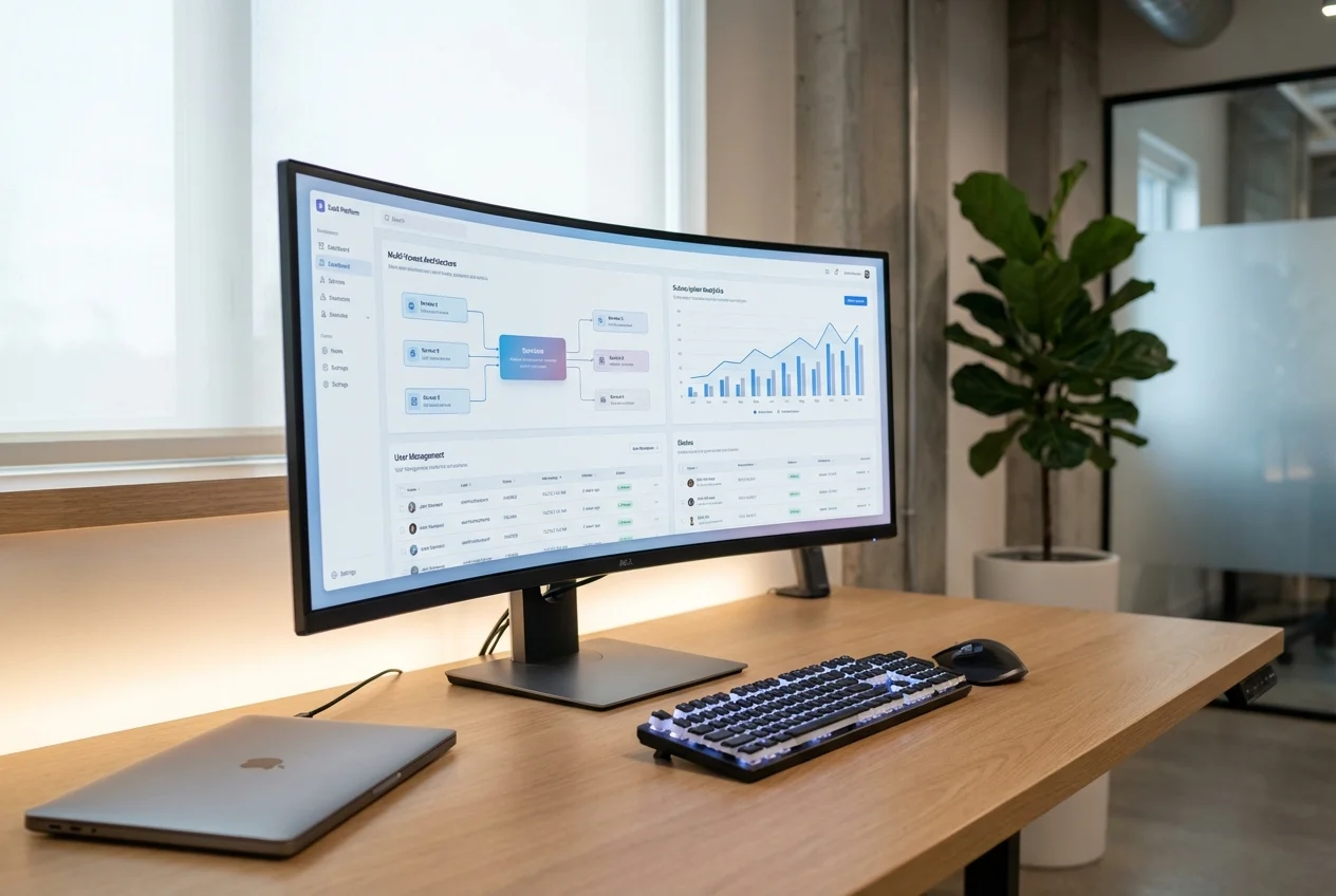
Your Figma design already represents this thinking — your designer made intentional decisions about every pixel, every spacing value, every interaction pattern. Implementing those decisions faithfully in code is not a luxury. It is the minimum viable quality that gives your product a chance to succeed.
If you have a Figma design for your SaaS MVP and want it built with the quality your users and investors expect, book a free consultation. We deliver production-quality MVPs in 2-4 weeks.
 Custom SaaS Development
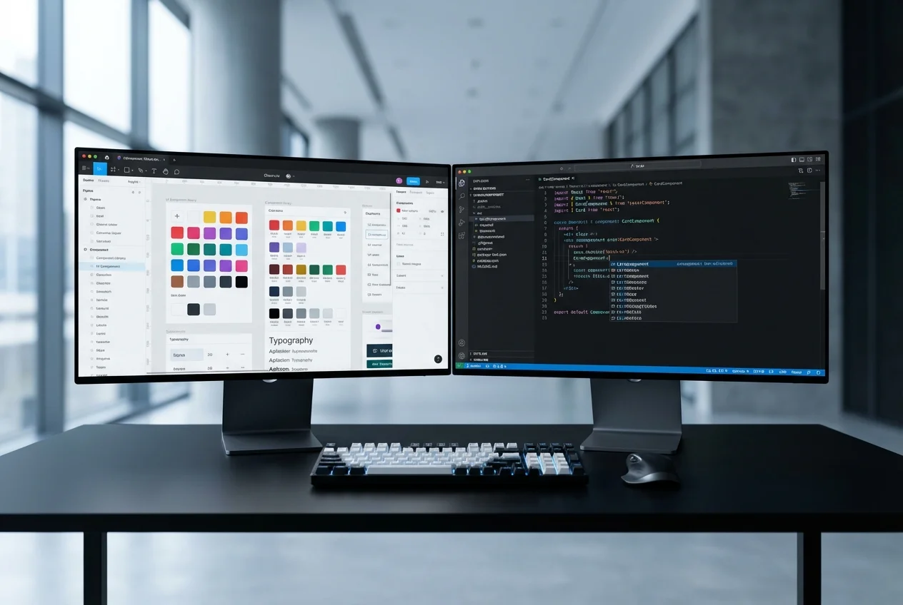 Figma to Code